


A Nonprofit Dashboard and Signal Light for Boards
A nonprofit dashboard gives important information to decision-makers such as executives and boards in a quick-read way.
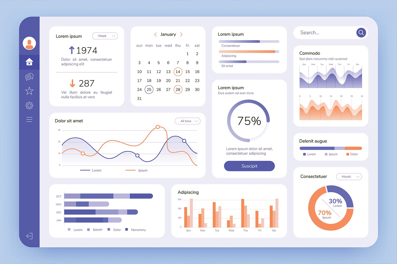
An organizational dashboard can be a fast way to check in on your nonprofit’s health.
(If you have trouble seeing the graphics in this article, you can download a PDF free here.)
The dashboard in a car gives an instant update on many important factors: Speed, gas left in the tank, engine temperature, whether the air conditioner is on. If your dashboard isn’t working, it’s unnerving and upsetting. But at the same time, when it is working, you glance at it from time to time but you don’t look at it constantly.
A nonprofit dashboard is similar: It gives important information to decision makers such as executives and boards in a quick-read way. But a dashboard has limitations: It doesn’t tell you if you’re taking the right road to Chicago, or more importantly, whether you should be going to Chicago at all!
The idea of making data — especially financial data — easily readable for board members is not a new one. Building on that basic idea, we’ve added two critical features:
- Action lights: When the oil pressure red warning light goes on, we know we need to do something. By adding Red, Yellow and Green lights, this Dashboard is oriented towards actions for the board to consider.
- Changes over time: A dashboard is useful if it just shows where things stand at this moment. But it becomes far more powerful when board members can see a trend line: Are things getting better or worse?
Finance dashboard
Nonprofit board members can be bewildered by complex financial presentations, and as a result, tend to ignore them. If, instead of the usual spreadsheets, think about what the reaction might to be to the following instead:
Board members would quickly turn their attention to the areas needing attention, and praise staff where progress has been made. The use of Red/Yellow/Green helps the board interpret the material, and the inclusion of prior information provides a feeling for direction.
The metrics in these examples may not be appropriate for your organization. In one Dashboard workshop, a participant noted that they try to keep their outstanding line of credit to below 5% of investments. It was easy to convert this unusual measure into a dashboard: Above 5% was red; 4 – 5% was yellow; Under 4% was green. This was far more useful for the board than their previous reporting only of the outstanding balance.
Fast reporting on program metrics
In contrast to finance, one of the least discussed metrics on boards is typically program implementation: the information is often unintentionally buried in multiple staff reports. Instead, consider adapting the following examples of human service, theatre, and advocacy programs:
A dashboard for “our greatest asset”
While it’s commonly said that “our people are our greatest asset,” board members often are unsure how to pay attention to the area of human resources without inappropriate meddling in management matters. As a result, the area is too often ignored all together, but an HR Dashboard can help reassure the board that the area is being handled well:

Using a dashboard for board accountability
It’s often difficult for volunteer board members to keep track of what needs to happen from year to year. Having a dashboard for the board makes it easy to communicate yearly responsibilities to a new board chair, and for her to keep it updated for the rest of board, thereby reminding everyone.
Fundraising Dashboard
Fundraising metrics are frequently reported to boards, but this makes them easy to see in a consistent way:
Dashboard for easily overlooked compliance and risk management
Few organizations have compliance or risk management committees on either the board or the staff, and it’s often easy to overlook these important matters. Adding a simple dashboard for these matters helps remind the staff of them, and reassures the board that these areas are getting enough attention.
The engineering behind the dashboard
In the car, when your gas indicator points to “Empty,” you probably don’t know exactly how much gas is left. Behind the scenes, an engineer has decided that, for instance, that it will point to Empty when there is one gallon left. Similarly, board committees can work with staff to determine what will be classified as Red, Yellow or Green. This calibration is crucial: by changing it you can make any situation look terrific or terrible. Most of the time the reader will trust the calibration choices behind the dashboard, so be sure that it is reviewed annually.
For instance, the Finance Committee might decide that having less than $90,000 in unrestricted cash puts payroll at risk, so they classify that as Red. A year later after layoffs, the staff might be smaller so that havig $50,000 is actually enough: $50,000 becomes Red, while $90,000 becomes Green.
Summing up
What makes this Nonprofit Dashboard powerful are some key features that many organizational dashboards lack:
- Signal lights: showing red, yellow and green rather that simply numbers helps board members focus on potential actions
- Trend lines: by showing the Dashboard over a period of time, improvement or decline is easily seen… often more important than simply the current status. When you start your Dashboard, don’t try to go back and fill everything in. Just keep the data going forward.
And finally . . .
Imagine getting a dashboard like this at every board meeting. With a glance, board members could see how the organization is doing and start asking the important questions. The board would also be able to discuss what indicators should be added to the dashboard and which might not be necessary. Board committees and task forces could develop their own dashboards for particular projects.
And remember the limitations of a Dashboard — it may not be helpful on bigger matters such as: Has X Program become stale? Should we be considering a merger? What does our constituency need us to be doing right now?
It’s hard to imagine driving a car without quick, ongoing access to a speedometer, fuel gauge, or gear position. An organizational Dashboard can be the same, fast way to check in on basics… so you can pay more attention to where you’re going.
You might also like:
- Nonprofit Leaders Answer: What is the Best Way to Handle Conflicts or Disagreements on a Nonprofit Board?
- Nonprofit Leaders Answer: What’s One Leadership Habit That’s Made the Biggest Difference for Your Nonprofit?
- Nonprofit Leaders Answer: How Does Your Nonprofit Onboard New Board Members Effectively?
- Creating A Board That Works
- Bylaws Checklist
You made it to the end! Please share this article!
Let’s help other nonprofit leaders succeed! Consider sharing this article with your friends and colleagues via email or social media.
About the Author

Jan is a former editor of Blue Avocado, former executive director of CompassPoint Nonprofit Services, and has sat in on dozens of budget discussions as a board member of several nonprofits. With Jeanne Bell and Steve Zimmerman, she co-authored Nonprofit Sustainability: Making Strategic Decisions for Financial Viability, which looks at nonprofit business models.

Jeanne Bell, MNA, is CEO of CompassPoint Nonprofit Services, and consults to nonprofits in business planning, financial systems, and sustainability. She co-authored Financial Leadership for Nonprofit Executives (Fieldstone).
Articles on Blue Avocado do not provide legal representation or legal advice and should not be used as a substitute for advice or legal counsel. Blue Avocado provides space for the nonprofit sector to express new ideas. The opinions and views expressed in this article are solely those of the authors. They do not purport to reflect or imply the opinions or views of Blue Avocado, its publisher, or affiliated organizations. Blue Avocado, its publisher, and affiliated organizations are not liable for website visitors’ use of the content on Blue Avocado nor for visitors’ decisions about using the Blue Avocado website.
Any insight on dashboard development software? We’d like to create a dashboard and have something online that we can share with our board members, modify and track indicators, etc. Something like CORDA’s Centerview.
Very helpful!
I really like this approach to a “dashboard” reporting/tracking tool. However, one simple logistical reality is that reports often get photocopied in black and white. Has anyone come up with a good visual/graphic alternative to the green/yellow/red illustration? Perhaps some simple symbols, or maybe red items = bold, yellow = plain font, and green = italic?? Not nearly as effective as the color, but…. Any ideas?
I really like this approach to a “dashboard” reporting/tracking tool. However, one simple logistical reality is that reports often get photocopied in black and white. Has anyone come up with a good visual/graphic alternative to the green/yellow/red illustration? Perhaps some simple symbols, or maybe red items = bold, yellow = plain font, and green = italic?? Not nearly as effective as the color, but…. Any ideas?
where can I purchase this dashboard? is it for sale?
[…] Is A Consent Agenda for a Board Meeting. Two good resources on the latter are an 2009 piece: A Nonprofit Dashboard and Signal Light for Boards by Jan Masaoka and Jeanne Bell, and Compass Point’s List of Dashboard Indicators […]